Monday

Monthly Archives: August 2014

New Articles posted to the Web #11

We have been busy beavers updating the PM Knowledge Index on our website with White Papers and Articles.   Some of the more interesting uploaded during the last couple of weeks include:

And we continue to tweet a PMI style of exam question every day for PMP, CAPM and PMI-SP candidates: See today’s question and then click through for the answer and the Q&As from last week.

You are welcome to download and use the information under our Creative Commons licence

PMBOK Health Warning

Health Warning:  Do not attempt to read the PMBOK and drive!

Animal tests undertaken by Mosaic show that reading a single chapter of the PMBOK can induce a state ranging from drowsiness to deep sleep; with the effect on younger animals being significant.

Similar effects have been observed from exposure to PMP training materials in the office……

As a result of these and other ‘real world’ observations, we recommend any prolonged exposure to the PMBOK and any associated training materials be restricted to either the safety of your own home, or a carefully controlled classroom environment under the supervision of a qualified trainer.

Notes:

  1. No cats were injured during this study.
  2. We have designed our courses to minimise the effects identified in this study.
    1. For more on our classroom training see:  http://www.mosaicproject.com.au/
    2. For more on our Mentored email training see: http://www.mosaicprojects.com.au/Training-Mentored.html
  3. Apart from Note 2, this post is simply a gratuitous excuse to publish some really cute cat pictures sourced from: http://pulptastic.com/29-photos-cats-sleeping-weirdest-places-positions/  we hope you enjoy the other 26 pictures.

Mind your language

Communicating ideas effectively to another person needs a common language, and a common understanding of the meaning of the symbols used in the language. While this sounds simple, language can take many forms including images, sounds and writing. This post is going to focus on the design and use of images as the language for communication.

The use of images as a language stretches back to the Ancient Egyptians. They developed a written language based on stylised pictures whereas the civilisations in the ‘fertile crescent’ developed cuneiform text.

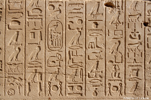
Whist we may not be able to read the Egyptian script, many of these hieroglyphs are easily understandable.

Whereas the cuneiform script is completely indecipherable. However, just because we can identify a goose at the top of the third column of the hieroglyphs, it does not mean we understand its meaning!

A simplified graphical language can provide a really useful way of communicating complex information but when you use the language, you need to be sure the people you are communicating with have the same level of understanding you do and ‘see’ the same message.

One of the first attempts to stylise complex information and to make it accessible and easy to understand was the development of the London Underground map.

The London Underground Map

The London Underground is one of the most complicated systems in the world.  By the middle of the 20th century the map was becoming too complicated for easy use.

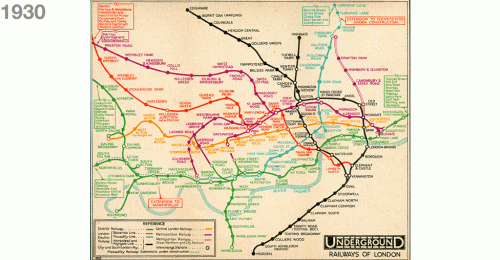
1930 Underground Map.

The concept of the topological map we all know and use was developed by Henry Charles Beck. ‘Harry’ Beck was an English engineering draftsman at the London Underground Signals Office. He developed the first ‘topological map’ in his spare time, based on an electrical wiring diagram.

London Underground was initially sceptical of Beck’s radical proposal and tentatively introduced to the public in a small pamphlet in 1933. It immediately became popular, and the Underground has used topological maps to illustrate the network ever since. There is even a book on the map: Ken Garland’s, Mr Beck’s Underground Map (Capital Transport Publishing 1994). The book describes the enormous care, craft, thought, and hard work of Harry Beck that went on for decades (exactly what it takes to do great information design).

Beck’s version of the 1930 Map.

This style of communication has carried through to modern times but is not without its problems – you can easily get to the station you want, but there is no indication of how close or how far apart different stations are ‘on the surface’ – particularly if the stations are on different lines.

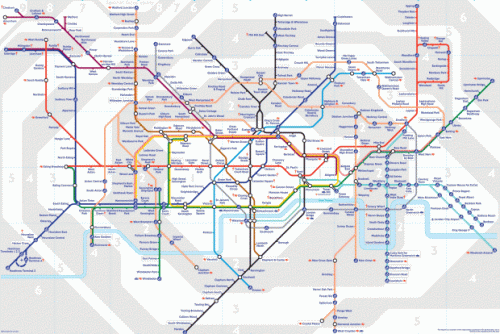
The current London Underground Map.

Success is contagious; most transport maps world-wide follow Henry Beck’s lead and a new universal language has been created.

Part of the new Melbourne Tram Map, using a version of Beck’s language.

The Melbourne map uses the same style as the underground map – lines are vertical horizontal or at 45 degrees, but unlike the underground stations, tram stops are not shown; the designers believe the street names and route numbers are more important.

Part of the Stuttgart Metro map.

Based on your knowledge of the London or Melbourne maps, you do not need to be able to read German to have a good idea how to navigate the Stuttgart metro from the Hauptbahnhof to the Zoo. The language of transport maps has become fairly standard world-wide.

However, design of the communication is still important; the designers of each map need to decide what is important (eg, the route numbers on the tram map), what is emphasised, what is suppressed, and what is left out – bad design can reduce the elegance of the communication and block understanding. Whereas innovation can enhance it – the Tokyo train system has its trains painted the same colour as the line used on the transport map – the orange trains follow the orange route and you get to the right platform by following the orange signs!

A similar convergence of communication style has occurred with in-car road maps. Most books and electronic sat-nav systems use a stylised language similar to the map of North Sydney (below) – another language designed for a specific purpose.

North Sydney

For the purpose of navigating a car to the ‘Aiki Kunren Dojo’, this ‘simplified road map’ is far more useful than the 100% accurate photograph of the same location!

North Sydney

The style of the road map above has been taken ‘virtual’ and global by several organisations including Tomtom. You do not need to be able to read the street names or understand the spoken advice ‘turn left in ……’ to follow the map – the pictures say it all and are just as effective in Shanghai and Munich as Sydney or Melbourne.

When designing a graphical communication language, useful, accurate and fully detailed are not synonymous! Both of the mapping languages discussed so far are really simple to use provided you have learned to ‘read the language’ and interpret them correctly. But as we all know North Sydney looks like the Google Earth photograph (not the map) and Melbourne’s geography only has a passing resemblance to the tram map – but we have learned how to read the ‘language’ and can then use that knowledge of the language to understand similar maps in different cities.

Project Maps

The same challenge applies to project dashboards, reports, and artefacts such as bar charts and CPM diagrams. Creating an appropriate level of understanding in a person’s mind about the true situation of the project and your intended work plans requires appropriate information to be communicated in a language that is understandable to the stakeholder. In this context, ‘appropriate’ does not mean complete or fully detailed; selecting the right level of detail is in itself an art form.  The bar chart below may be fully detailed and precise but it is not a good communication tool!

And while preferred by many project controls professionals, the CPM logic diagram below is even less likely to work as a communication tool for stakeholders.

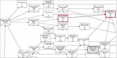
These specialist languages are useful to trained project controls professionals and some experienced project management professionals but are too complex for most communication needs.

As suggested above, effective communication does not need fully detailed or accurate representation. What is needed is ‘useful’ information that can be used!  You do not need to be an expert in directional boring to understand the plan for this project (all that is missing is the timing for each stage):

Simple is good, simplistic is dangerous! One of the popular options for reporting project status is using simplistic ‘red-amber-green’ (RAG) traffic lights such as these:

We know there is a scope problem but there is no real indication of the seriousness of the situation or how far into the ‘red zone’ the project actually is.  Rather than the simplistic 3 point RAG scale, the same information can be displayed using more insightful tools:

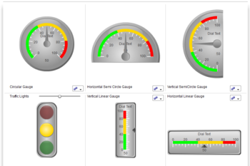
Any of the ‘gauges’ will tell you where within each band the project is situated, add in a simple ‘change’ report and the trend becomes apparent as well. The art is knowing how much information is enough.

Conclusion

From the hieroglyphs of the Ancient Egyptians to the Tomtom road map, the art of using pictures for effective communication is creating a set of symbols that communicate your ideas and information simply and accurately, and then taking the time to teach your stakeholders how to read the language.

Effective communication, focused on obtaining the understanding and buy-in from a stakeholder needed to deliver a successful project requires:

  • Understanding who are the key stakeholders at ‘this point in time’ that you need to influence;
  • Understanding their needs and the best way to communicate with them (the Stakeholder Circle® methodology is designed for this purpose);
  • Communicating the appropriate amount of information in a way that can be understood by the stakeholder; and then,
  • Taking the time to help the person reach a proper understanding.

The communication challenge is recognising that some concepts will be easy to communicate in some communities of stakeholders, others will be more difficult; and people are frightened of things they don’t understand.

Designing an effective communication strategy requires the project team and project leaders to firstly derive a common understanding between themselves, then determine what the key stakeholders actually understand, then determine how to communicate effectively with the key stakeholders to build their understanding to the level needed to get the ‘buy-in’ required to make the project successful.

Effective communication is the tool that builds understanding, reduces opposition based in ‘fear of the unknown’ and generates a framework for success – for more on effective communication see: http://www.mosaicprojects.com.au/PM-Knowledge_Index.html#PPM07

Predicting Completion

At one level, completing on schedule has been a requirement, enforced to a greater or lesser extent for millennia. In the 1905 English court case Clydebank Engineering and Shipbuilding Co Ltd v Don Jose Ramos Yzquierdo y Castaneda [1905] AC 6; the court was prepared to uphold a ‘liquidated damages’ clause for delivery at the rate of ₤500 per week for each vessel not delivered by the contractors in the contract time. And rather more sever penalties could be imposed by Roman Emperors for late delivery.

As governments do today, the Romans outsourced most of their major works to contractors, with both public accountability and a legal framework as key governance constraints. What was significantly different was the consequences of failure! If a project went badly wrong in Roman times, the responsible public official would suffer a major career limiting event that could affect the prospects of his descendants for generations to come. Whilst the retribution applied to the contractor could be even more serious including death as well as retribution for generations to come.  Applying the Roman approach could give a whole new meaning to the ‘pain share’ part of a modern Alliance contracts…… as well as removing by execution many of the worst performing contractors. Rome was not built in a day but their empire did last for close to 1000 years [Frontinus – A Project Manager from the Roman Empire Era by Walker & Dart (Project Management Journal Vol.42, No.5, 4-16].

However, whilst there was undoubtedly an imperative for timely completion of contracts (projects in today’s terminology), there seems to be little in the way of predictive processes used by managers to assess the current expected completion date prior to the 1950s.

Having said that, I’m as sure that ‘smart people’ would have been assessing the expected completion of any significant ‘body of work’; both during the planning processes and during the course of the work. You simply cannot run a factory profitably if you cannot tell a customer when to expect his order – but predictive assessments and predictive processes are quite different.

Cost management and accounting has documented roots more than 6000 years old (provided you can read clay tablets), with modern book keeping emerging in the 15th century. I have found plenty of evidence of proficient governance and effective cost control on projects in the 17th, 18th and 19th centuries but so far nothing ‘predictive’ (cost or time) until the 20th century. Prior to the 20th century, ‘cost control’ focused on comparing actual costs against the planned cost (a process still common in many organisations).

Similarly, the idea of probability and making calculations about future outcomes from a risk management perspective can be traced back to the 17th century and the work of Newton, Leibniz, Bernoulli and Pascal.  These mathematicians advanced probability to the point where life insurance and annuities could be bought and sold, but again there seems to be little cross over into the realm of predicting project outcomes until the 20th century.

From a time management perspective, William Playfare ‘invented’ graphical statistics (including bar charts) and published a series of different charts in his Commercial and Political Atlas of 1786.

However, whilst Playfair’s charts are detailed and accurate, they only report history; trends and forecasts were not considered (or at least not published).

There is a continuum from these early charts through to the work of Henry Gantt (who is falsely accredited with developing ‘project management’ and ‘bar charts’) some 200 years later (for more on this see: The Origins of Bar Charting).

The most sophisticated of Gantt’s charts described in ‘The Gantt chart a working tool of management’ (Wallace Clark, 1923) shows slippage or acceleration on the overall target production for one batch of parts on one machine, but again this work does not extend to predicting the completion date for the work, or a related set of activities.

From a measurement perspective, the concept of ‘piece rates’ can be traced back to the 16th century (the phrase ‘piece work’ first appears in writing around the year 1549). Piece work requires measurement of performance to calculate a workers pay and record keeping. However, whilst there is ample evidence of people being measured and paid this way for more then 400 years, there is little indication of this information being used to predict outcomes.

Measuring performance was integral to Taylor’s scientific management and the work of Henry Gantt, Chapter 3 of Gantt’s ‘Work Wages & Profits’ focuses on incentives and bonus payments for production work in machine shops. Foremen and worker are to be paid a bonus if they achieve the target production time for a ‘piece’ of work. The bonuses are calculated after the event and nothing in work wages and profits refers to any form or predictive scheduling beyond the usual planning needed for machine loadings. Gantt’s work is the most advanced of any of the options discussed to date, but all of his charts are focused on highlighting problems so that management action could be directed to resolving the problem.

In short, nothing in the documented practice of accounting, ‘bar charting’, or piece rates, or Gantt’s motivational bonuses, were designed to predict the completion date of the work or it finals cost based on performance to date. All of these processes, including Gantt’s, were focused on solid planning and then working to achieve the plan by eliminating problems that caused slippage to make sure the work was accomplished in accordance with the plan (reactive management).

Whilst there would have been very little effort required to take the actual, planned or estimated production rates (minutes per unit) and divide that into the lot (scope of work) to predict when the production lot is going to be finished, no one seems to have taken this step. The start of predictive calculations does not seem to have emerged until operational research people started playing around with the concepts during WW2 (1940s).

Predictive time focused planning emerged at some time in the late 1940s or early 1950s with the development of linear programming in association with OR, which in turn morphed in CPM , PERT, MPM and a number of similar techniques all around the same time in the UK, Europe and the USA. Prior to the 1950s the focus was on ‘how far behind’ is any element of the work; the advent of network based scheduling allowed a process for predicting completion to be developed. Kelley and Walker’s 1959 paper is very clear on this (see Annex in A Brief History of Scheduling). From these time management foundations, PERT Cost emerged, then C/SCSC which in turn grew into EVM and more recently Earned Schedule (see: Predicting Completion).

Today, project controls are expected to predict cost and time outcomes for each project and in both business and government the expectation of forward predictions of profits, incomes and expenditures are normal.

The question posed by this blog is that given the fact astronomers were predicting celestial events from 1000 BC or earlier; and some of the charts and risk assessments we use today were available from at least the 17th century if not earlier, were these concepts used by managers to predict work outcomes?  Or did all of this emerge in the last 60 years??

More precisely, is there documented evidence of someone using current performance to update a plan and predict cost, time or other outcomes before the 1950s?

The evidence I have found to date that suggests predictions are very much a development of the last 60 years is freely available at: http://www.mosaicprojects.com.au/PM-History.html. I would be delighted to be proved wrong!

New Articles posted to the Web #10

We have been busy beavers updating the PM Knowledge Index on our website with White Papers and Articles.   Some of the more interesting uploaded during the last couple of weeks include:

And we continue to tweet a PMI style of exam question every day for PMP, CAPM and PMI-SP candidates: See today’s question and then click through for the answer and the Q&As from last week.

You are welcome to download and use the information under our Creative Commons licence

Designing effective KPIs

In a couple of posts I highlighted the damage that poorly considered KPIs and incentive payments can cause either to the organisation or its customers:

This post fills the missing link and discusses the practical challenges of creating effective KPIs.

Key Performance Indicators (KPIs) exist to influence decisions and actions; effective KPIs motivate people towards taking valuable, and useful, actions and decisions. Each KPI is a measure of how well a fundamental part of the project (or organisation) is progressing towards achieving its goals. The elements of a KPI are:

  • Key = something that is important, essential, fundamental.
  • Performance = the execution or accomplishment of work
  • Indicator = a measure, and record of variations

The specific purpose for each KPI is to communicate a relevant summary of the current situation to a particular person, or group; giving an indication of how effectively a particular element of the project (or work) is achieving its objectives. Because the KPI is an ‘indicator’ it does not have to be all encompassing, or provide all of the information about the activity. The purpose of a KPI is to highlight if and when more investigation is needed; they do not replace everyday ‘project controls data’ and other management information.

The challenge with KPIs is to set measures that provide indicators of potential problems in sufficient time to allow investigating and action. The purpose of most projects is to create value through the realisation of benefits; unfortunately this ‘real measure’ only happens after the project is finished. So whilst tracking benefits realised is important, the information lags behind the actions that affect the outcome. Other leading indicators are needed that focus on the probability of generating value during the course of the work (which is more complex than simply measuring time and cost performance).

The way to design effective KPIs involves six simple steps:

  1. Understand your audience and tailor specific KPIs for different levels and groups within the project and the project’s stakeholder community. Detail should decrease as you move up that structure, what’s useful to a team leader is information overload for a sponsor.
  2. Be clear and concise. Each KPI should be designed to deliver a message that will instigate one of two decisions; either ‘do nothing’ or ‘investigate’! The KPI’s job is to tell you one of these three things (any more information and it is not an ‘indecator’):
    1. Things are looking bad – investigate and fix
    2. Things are looking good – investigate and learn
    3. Things are OK – do nothing.
  3. Make the KPI understandable. The KPI is an indicator of how well specific work is being done, or accomplished; being clear about precisely what work and what goals is critical. This means the KPI has to:
    1. Be well written;
    2. Contain one clear measure;
    3. Set realistic targets;
    4. Be time framed;
    5. Define how the data will be tracked.
  4. Balance the KPIs across the performance window:
    1. Input KPIs – measure the quantity and sometimes quality of inputs to the project.
    2. Process KPIs – measure the quantity and sometimes quality of the work required to produce certain expected outputs.
    3. Output KPIs – measure the quantity and sometimes quality of the goods or services created.
    4. Value KPIs – measure the quantity and sometimes quality of the results achieved through the delivery of the goods and services eg, benefits realised.
  5. Use both types of KPI:
    1. Target KPIs focus on achieving a specific measure (pass / fail), usually within a time frame, eg, units delivered per week.
    2. Directional KPIs measure tends. With many KPIs the precise number is less important than the trend. For example, “Number of days lost to staff sickness” [per month]. Here the exact number of days is not that useful as we can’t control this, however if the trend is rising we can investigate and take action accordingly.
  6. Test and fine tune the KPIs, make sure you are getting the results you want. As both of the referenced posts have demonstrated, it can lead to disaster if you simply design, then implement, a KPI as a way to allocate bonuses without fully understanding if and how it can be ‘gamed’ or how it will affect morale, or any other unforeseen outcomes. Therefore:
    1. Allow some lead time to check that everyone understands the KPIs, if the outcomes being measured are reasonable and the data is easy to collects and accurate.
    2. Trial the KPI to make sure it is driving the behaviours you desire.

Finally, the characteristics of good KPIs are:

  • Simplicity. The metric name should be less than 5 words and the calculation is easily described in under 10 words.
  • Comparability. The measure is comparable to other time periods, sites, or segments.
  • Incremental. A rate or ratio is better than an absolute or cumulative value.

Some good KPIs include:

  • The accident (and ‘near miss’) rate on engineering and other ‘hard hat’ projects, a low rate indicates a safe environment which means a clean, well managed and well planned workplace.
  • Performance measures such as the number of activities completed within 5% of the estimated time (the workers cannot control the start but can control the flow of work once started).
  • The number of open issues (and the trend), or the number of issues that remain open after a ‘reasonable period (say 2 weeks).
  • Quality measures.

A final thing is to remember setting two or three effective KPIs and using them effectively across all projects is better than a scattergun approach. You know you have too many KPIs when you hear people saying things such as the “top KPIs” or “most important KPIs”. Keep them simple, consistent and rigorous for the maximum benefit.

A History of Scheduling – 2nd Edition

One of my major papers, ‘A Brief History of Scheduling’ has been updated and republished  in the August edition of PM World Journal, the free online publication devoted to knowledge creation and sharing, and continuous learning in the field of modern program and project management.  To see the published article and sign-up for you free monthly journal see:  http://pmworldjournal.net/article/a-brief-history-of-scheduling-back-to-the-future/

This paper is one of a series looking at the origins of project management. the full set of papers can be accessed at: http://www.mosaicprojects.com.au/PM-History.html